
or: Set the Table First
Someone lands on your website.
They are not browsing. They are looking for something specific: an answer, a price, a reason to stay.
They have about eight seconds to find it.
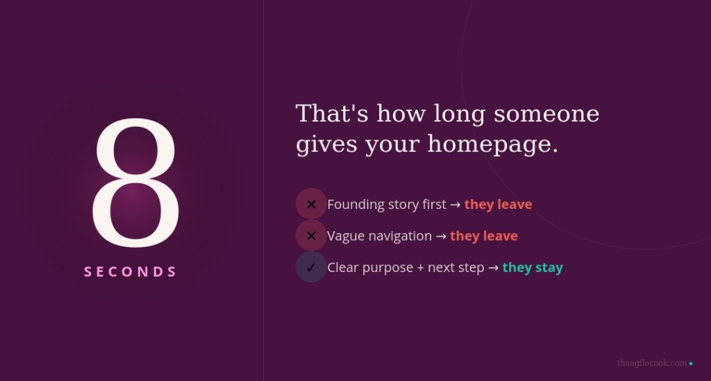
If your homepage starts with your founding story, or your navigation says „Solutions” without explaining what the solutions you solve, they leave. Not because your offer was wrong. Because the table was not set.
Three people read every page you publish
Here is the part most people miss.
A modern website has to work for three readers at once: the human visitor, Google, and AI tools that summarise your content before anyone clicks.
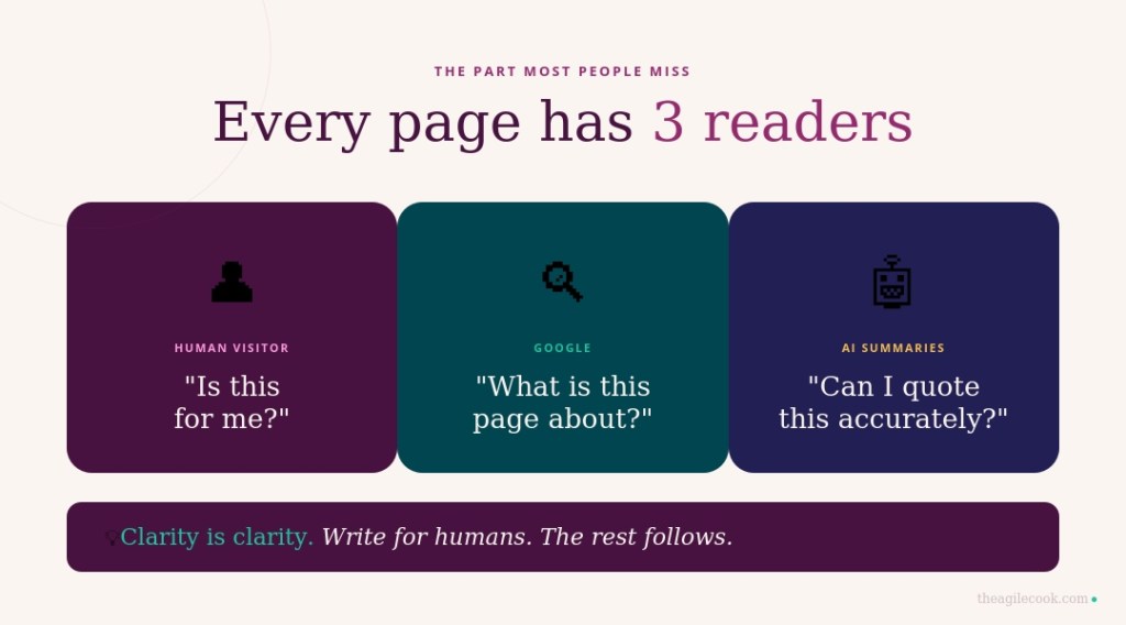
Think of it like cooking for guests with different needs at the same table. The dish has to work for all of them — not because you are performing for each one separately, but because clarity is clarity. A page that is genuinely easy for a human to understand is also easy for Google to index and easy for AI to quote accurately.
Google says it plainly: make content helpful and reliable, for people first. The rest follows.
So the question is not „how do I rank?” but: is each page clear enough that anyone reading it immediately understands what it is about, who it is for, and what to do next?
The map
A website is not a brochure. It is a kitchen with stations — each one doing a specific job.
Homepage. Orientation, not autobiography. What you do, for whom, why it matters, and where to go next.
Core offer pages. One page per service or product. One intent per page. This is important: a page trying to do three things usually does none of them well.
Audience pages. „For travel agencies.” „For families.” „For corporate teams.” These exist so the right person recognises themselves immediately — and the wrong person quietly self-selects out. Both outcomes save time.
Proof layer. Testimonials, case studies, real photos, results. Not decoration. The thing that turns interest into trust.
Knowledge layer. Your blog, your answered questions, your insights. This is where depth lives and where trust compounds quietly over time.
About page. Credibility first, biography second. Not who you are — why someone should believe you.
Contact page. One clear action. No friction between the decision and the next step.
The shape of every page
Every important page has the same anatomy. Once you see it, you cannot unsee it.
H1: say exactly what this page is about. Not clever. Exact.
First paragraph: who this is for and what problem it solves. A reader should recognise themselves — or understand it is not for them — before they scroll.
The middle: what you offer, how it works, why it works. Simple language. Steps. No terms that only your industry uses.
Proof: earned trust. Not claimed — demonstrated.
FAQ: the questions people are too polite to ask out loud. And the ones they typed into Google before finding you.
One CTA. Book. Enquire. Apply. Contact. One. Repeated naturally. Not four options asking to be chosen at once.
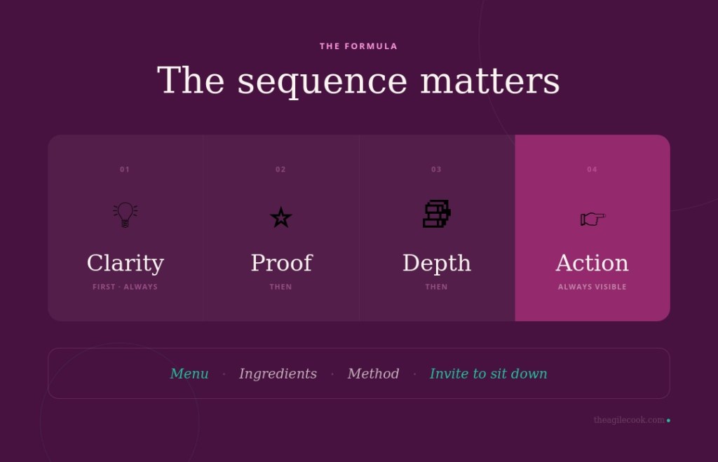
The formula
Clarity first. Proof second. Depth third. Action always visible.
Or from the kitchen: menu first, ingredients next, method after, then the invitation to sit down.
The sequence matters. You do not serve dessert before the main course just because it is your favourite part.
The Agile Cook’s note
Structure is not bureaucracy. It is hospitality.
A well-structured website does not tell people what to think. It removes the effort of figuring out where to go, so they can focus on deciding whether to stay.
If you are looking at your website and something feels off but you cannot name what — it is usually this. Not the design. Not the copy. The clarity underneath both.
That is exactly what the Marketing Plate helps with — a five-minute diagnostic to find where the real imbalance is.
Or, if you would rather think it through together: Work with me →

Lasă un comentariu